Review Page -
Les Numériques
UX Design
The Context
Lesnumeriques.com is a French media site which hosts all kinds of content about a wide variety of tech products, from smartphones to washing machines. Not only do they post news and product reviews, but also comparisons, buying guides, tutorials, and long-form reports about the latest in the tech world. When I arrived, the team was beginning to prepare a complete redesign of the site, which allowed me to start working from a mostly clean slate.
The Mission
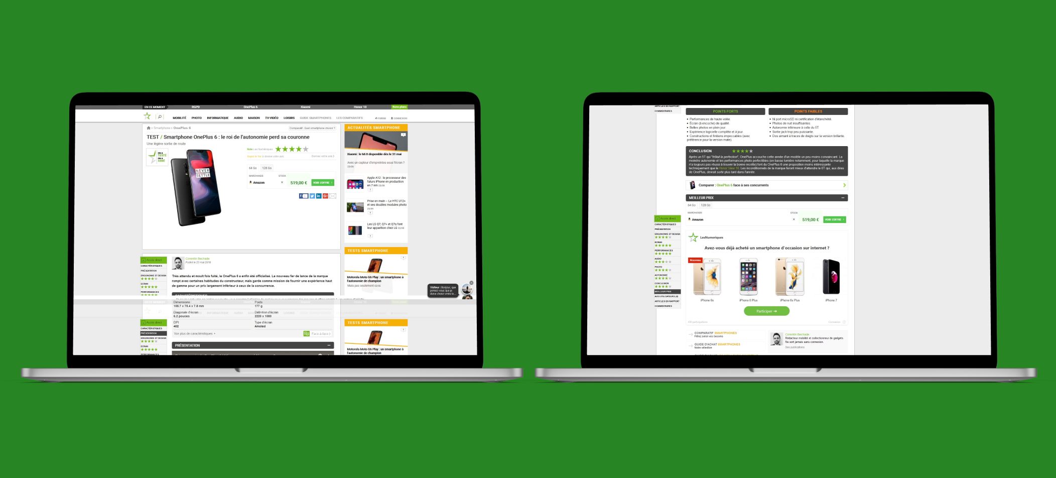
The product review page is probably the singularly most important page on the site because it’s usually the only page with leads on it (the price table which generates income for each click). However, that’s not the only reason. It’s also important because it’s one of the biggest reasons users visit Les Numériques: the product reviews themselves. However, the current version is faced with lots of problems.
A view of Les Numériques' old product review page.
Among these problems is the fact that the call to action for a user to submit his/her own review of the product is tiny and grey, making it difficult to find. This leads to pretty low numbers in terms of user engagement, despite the fact that many of the tests are viewed by tens to hundreds of thousands of users, especially in the smartphone section. Another problem is that while the rating for the review is visible, there is no breakdown immediately visible for why that note was given. The user is obligated to scroll all the way to the bottom of the test (which can be very long) in order to find the positives and negatives of the product and a concisely written conclusion.
On top of that, the little navigation panel bolted to the left side of the screen is not very obvious or engaging, making it hard to navigate the test. If a user is only interested in reading about a phone’s camera, they’ll find it difficult to discover the section of the test dedicated to that. There is also virtually no way to access the comments (or even see how many there are) until you’ve scrolled all the way to the bottom of the page.
I started with some initial versions of the mobile view.

Version 1
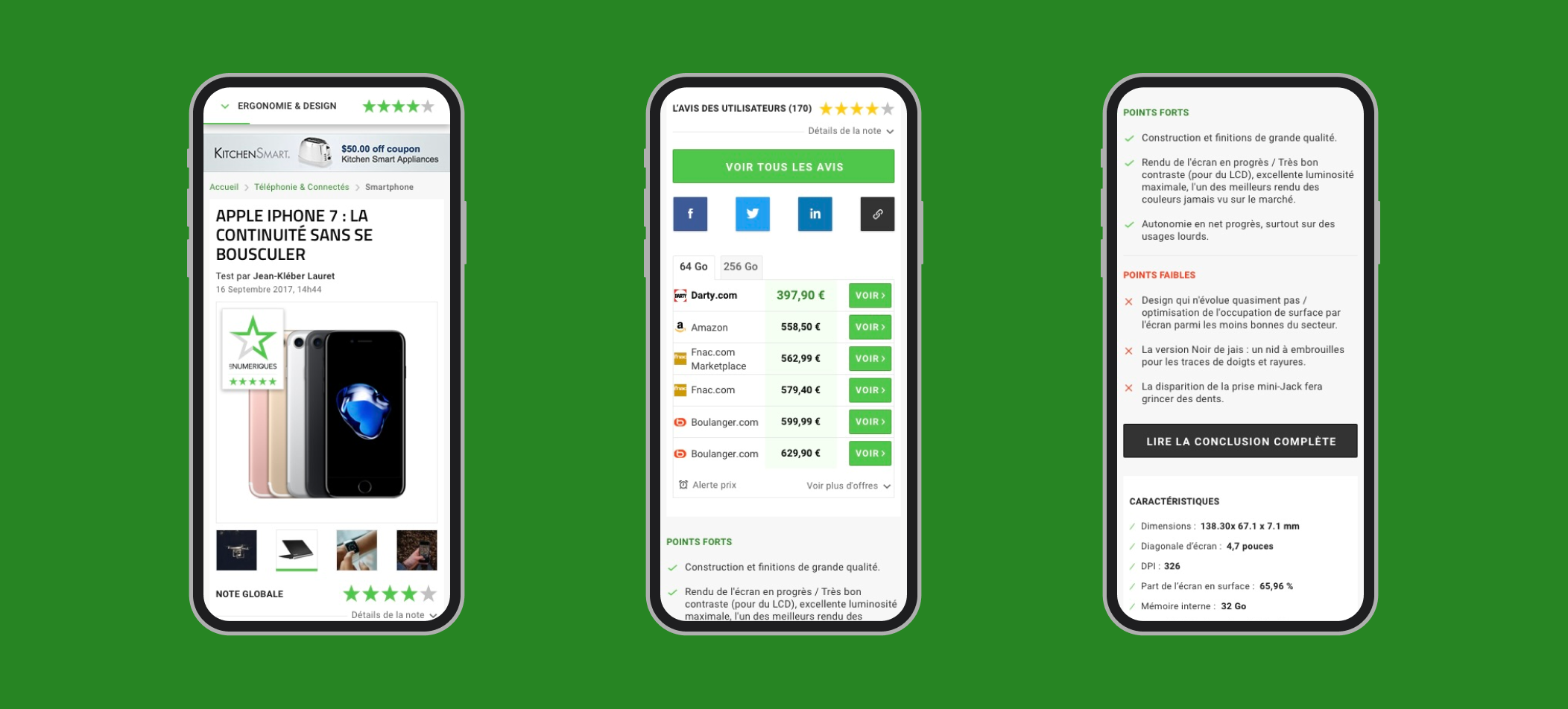
You’ll notice right away that I’ve added a way to navigate the test, right at the top of the page. It displays each section of the test as you scroll, and you can tap/click on it to display a dropdown of the different sections and their rating, from which you can choose one to quickly navigate to that section. There is also a clearly visible option for viewing the comments (and how many there are) and for submitting a user’s own review of the product. A button for viewing the conclusion can be found just below the product specs.
However, after discussing it with our design team and after doing some research on other sites’ review pages, we decided it would be better to put the positives, negatives, and conclusion directly at the top of the test so that the user would be able to easily read a summary of the test.

Version 2

Version 3
A couple versions later and we’d cleaned up the design of the comments at the bottom of the page and made the button to add a comment full-width instead of the same size as the social media buttons, to give it more emphasis and clarity.
For the final version of this design, we decided to change out the button to comment for a button to leave a review of the product, and moved the comment button down to make sure that the user’s were going to read a bit of the review first before leaving a comment. We also added another comment button to just above the price table at the bottom of the test, and added some buttons to read the reviews / comments at the very bottom of the page for clarity.
A view of Les Numériques' new review page, mobile view.
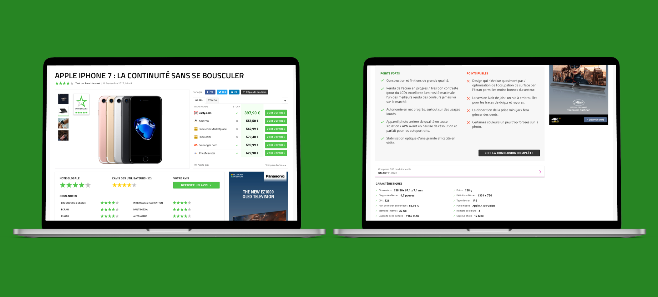
I think that this project was one of the more challenging ones in how long it took and the many problems we had to tackle, including the ones that didn’t present themselves until after we had some semi-finalised versions of the design made. I am confident that this new design will perform well and that we have solved many of the problems.
A view of Les Numériques' new review page, desktop view.


