Perfume Product Page -
Beauté Test
UX Design
The Context
Beauté Test is a French beauty site targeted mostly towards women and features product reviews, articles, and opportunities for users to test soon-to-be-released beauty products from major brands like Dior, Chanel, L’Oréal, and more. The design and code behind the site is pretty far from the premium brands which features on its pages, however. It’s a bit dated, and while waiting for a site-wide redesign, certain areas needed a facelift.
The Mission
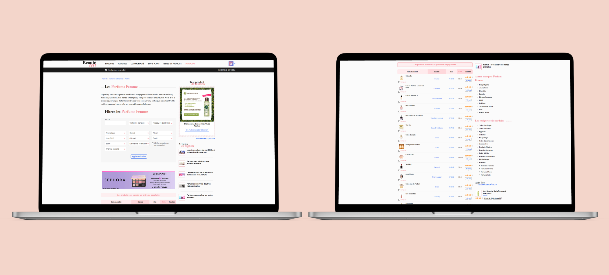
While the site holds hundreds of product subcategories, the one that really needed focus was the perfumes. Our team wanted to redesign the perfume section to make it feel more luxurious and premium, like the brands featured on the labels. The old section, like the other product categories, looked like this:
A view of Beauté Test's old perfumes hub.
You can see that you actually have to scroll a fair bit just to even see the products. The block of filters is huge and intrusive, there’s no way to collapse it. On top of that, it’s incredibly busy and confusing, with seemingly no logic behind the order of the dropdowns. Then there’s a miles-long table with miniscule photos of the products, making it hard to find what you want.
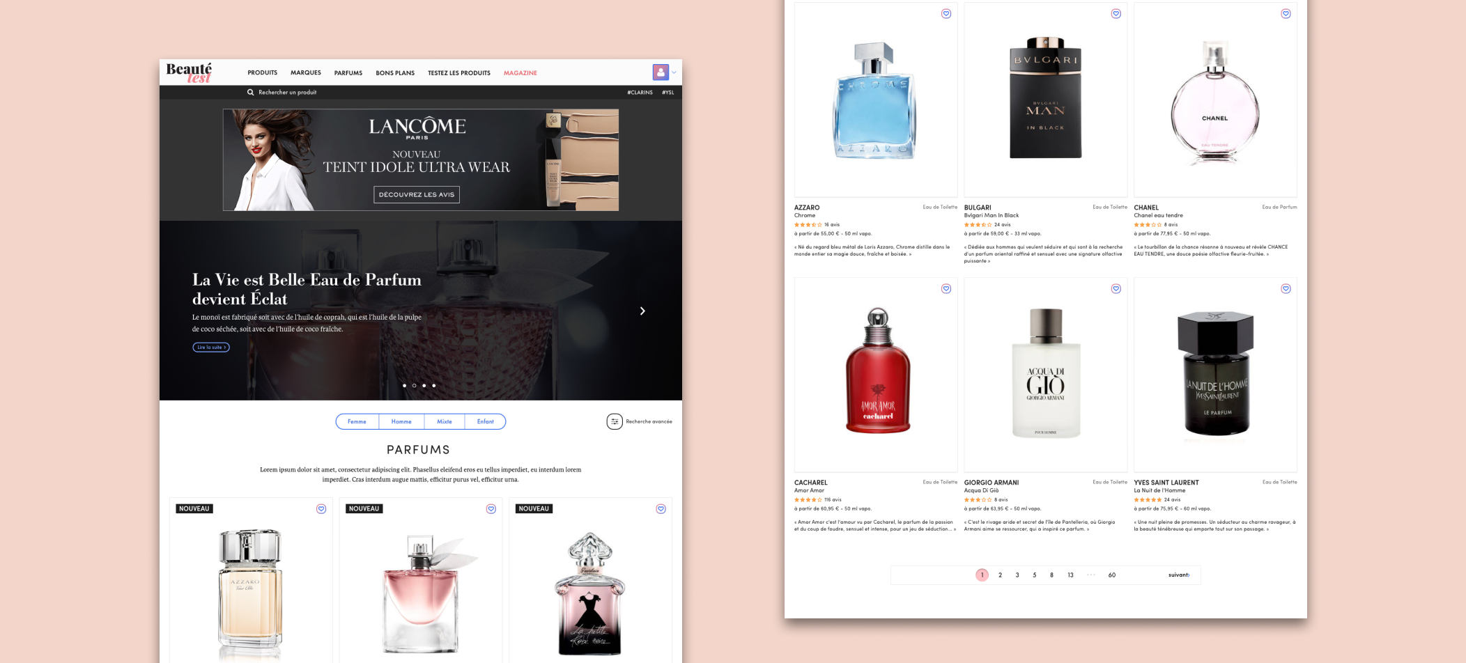
In my version of the page, the products are the focus. The images are large, to show off the classy style of the perfume bottles and let the beauty of the product itself do the talking. I did a survey of around 40-50 people and found that, when making a purchasing decision about perfume, the scent/fragrance, brand, and price are most valued. They didn’t actually care that much about the reviews given by other people because perfumes are so subjective. I also found that on other, competing websites, most of them had a setup like this, where the images were large, the brands given the spotlight. So, I made this:
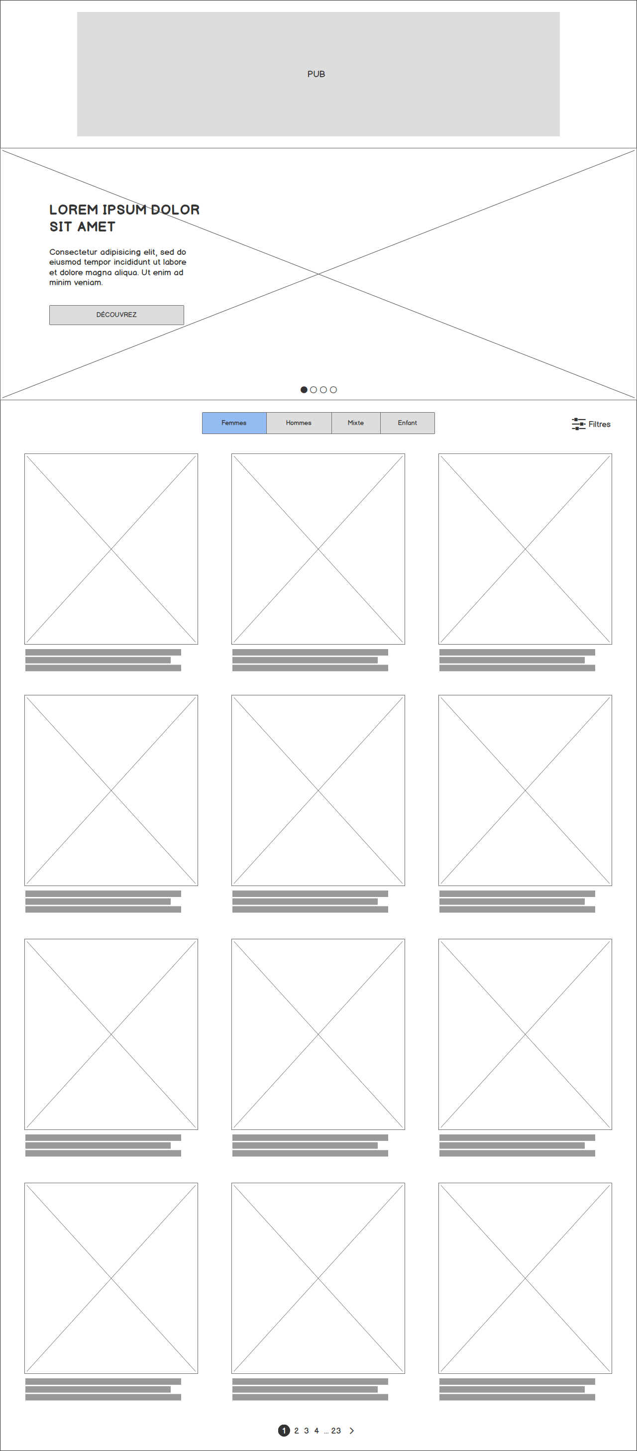
Hub wireframe
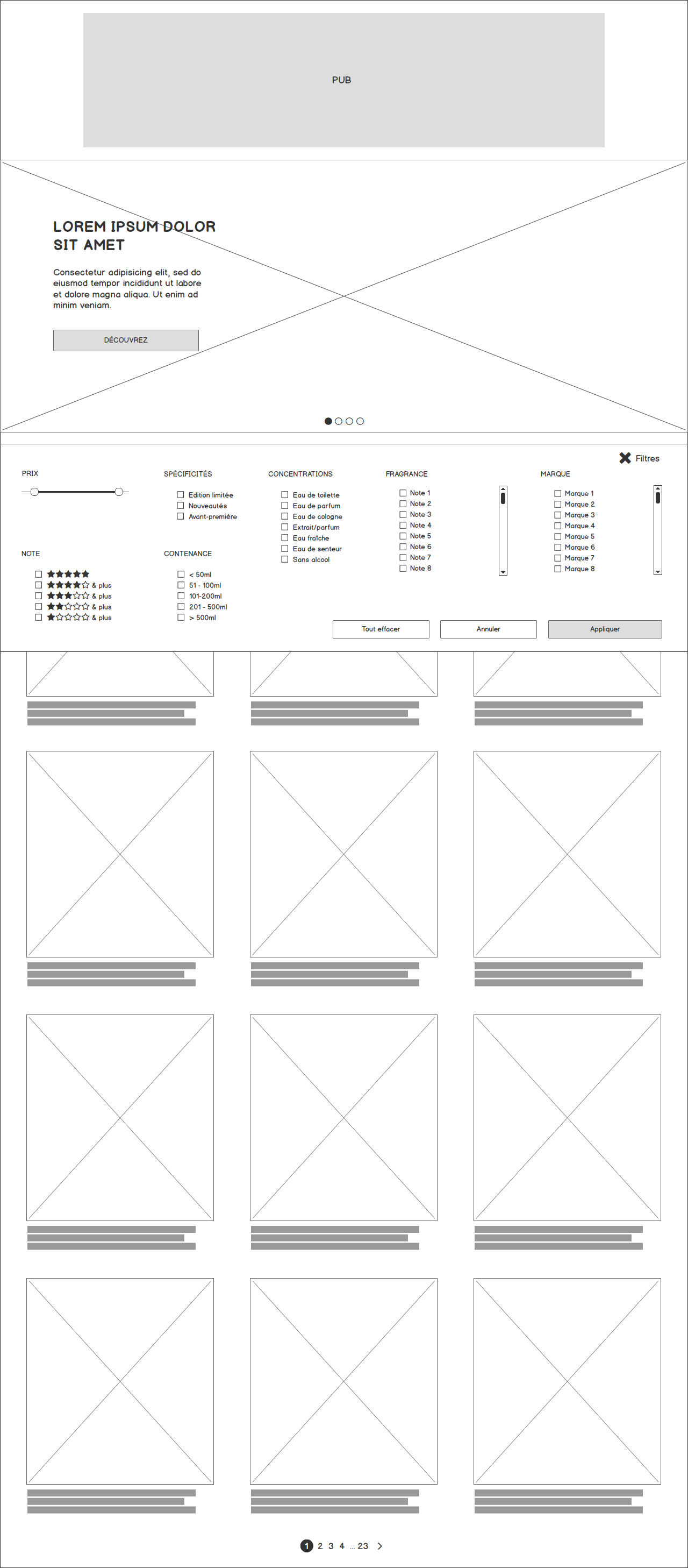
Hub wireframe (with filters)
You can see first off that the products are the main focus, and the user can easily filter the perfumes by whether they are searching for a woman, a man, gender neutral, or a child. Next to that, there is a button for the filters, which is a panel that appears and shows an organised row of filters the user can specify, which are clearly ordered by demand and which ones are mostly used. It’s expansive, but collapsible, so poses no problems in terms of taking up space.
The carousel above is for content about new perfumes that have been released, or news related to upcoming products.
A view of Beauté Test's new perfumes hub.
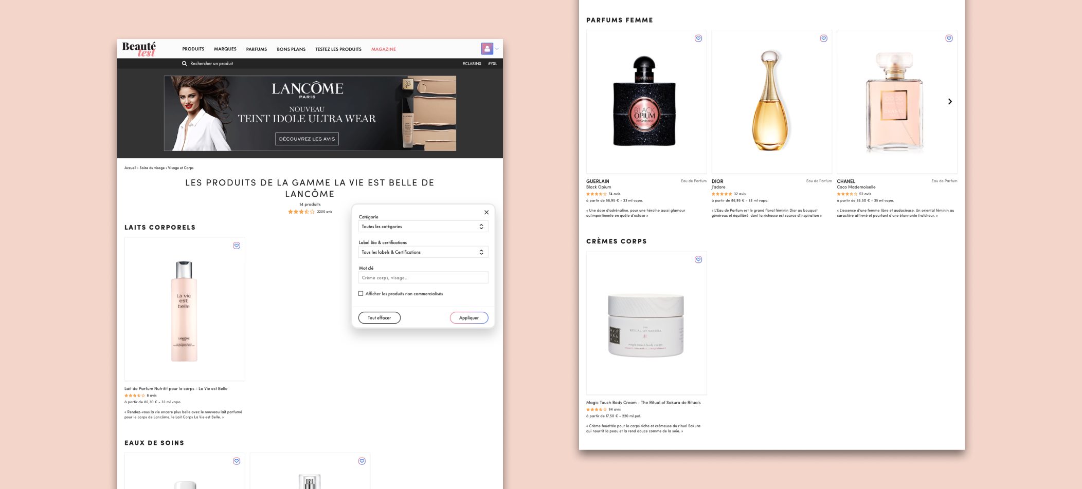
However, another problem that was posed by the old design was the fact that, in particular with perfumes, the brands often released a range of products that they marketed together as one group. Previously, we had no simple way to display a range of products from a brand on one page. So, I made a simple wireframe to fill that need.

Product range wireframe

Product range wireframe (with filters)
You can see that I’ve organised the products by category, and I’ve also included a similar panel of filters so that the user isn’t burdened by the scroll bar and can easily find the type of product desired in that specific product range.
A view of Beaté Test's new product range page.
I think we gave the perfume section a proper, luxurious look and feel and largely addressed the problems posed by the current iteration of the product subcategory pages. This was a fast-paced project, with my end of things being completed in just a couple weeks, and most of the modifications being done in conversation instead of in wireframe.
