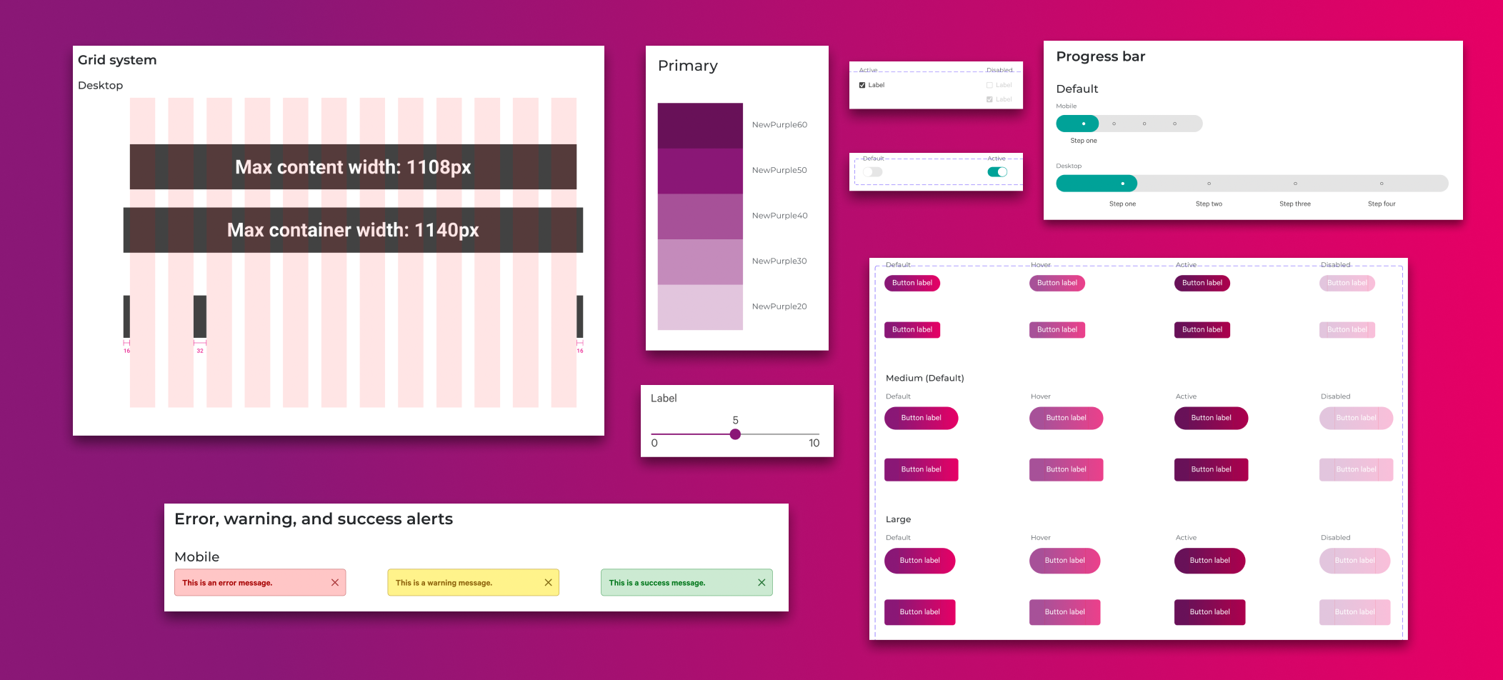
I began with the most core aspects of the design system, the very backbone upon which all the components are built: the grid system.
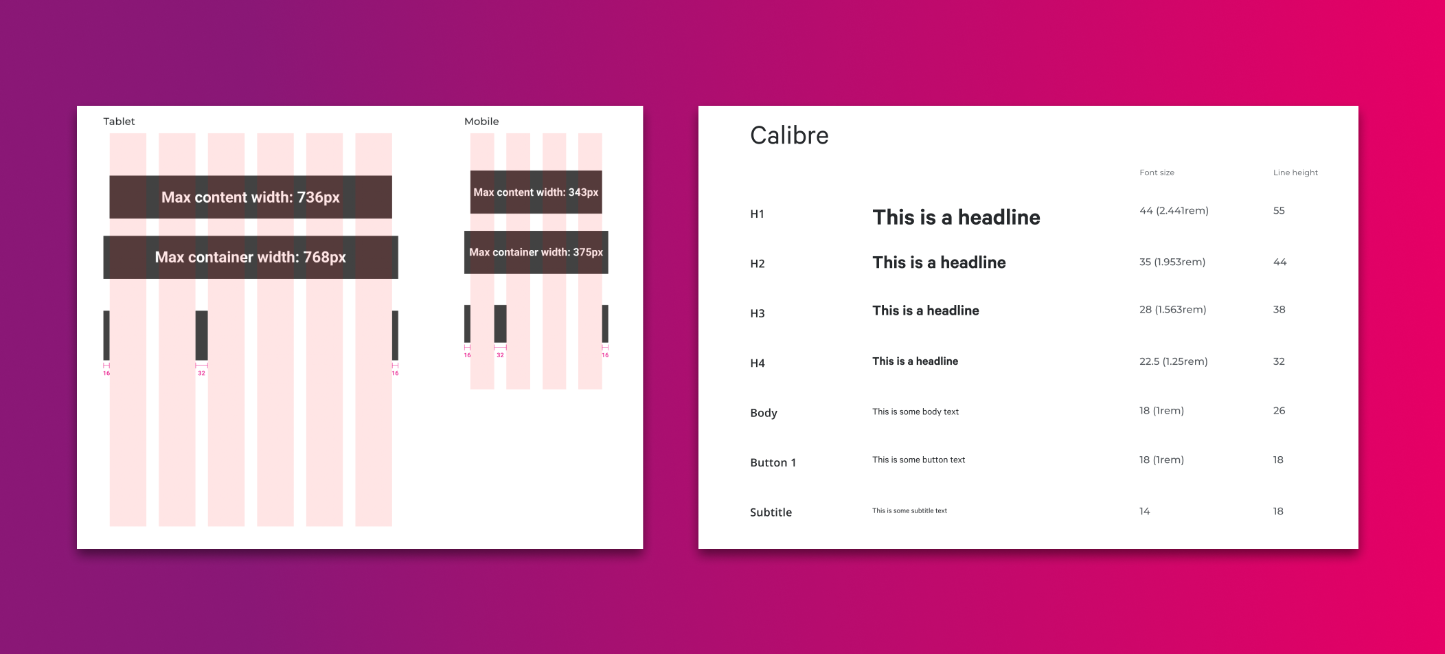
I established a 12-column grid, spaced 32px apart on all viewports, in order to maintain a consistent visual experience across devices. After consulting with our lead front-end, we decided that basing the design system on Bootstrap and Vue.js (a technology we were already beginning to implement slowly) was the best way to quickly get us up and running with a good base. Therefore, many aspects of our system are similar to Bootstrap, with some modifications. I knew that this would present us with some design limitations (mostly related to page layout), but given that the majority of our projects were very similar in nature, yet were being developed with custom code every time, it was a sacrifice I was willing to make in order to speed up dev time and improve user experience.
It was also important to me to set up a consistent vertical pixel grid. Given our needs, a simple 4px grid seemed most appropriate to me. Using spacing slugs of 4, 8, 16, 32, and 64 pixels, as well as ensuring that the typographic hierarchy also uses line-heights of multiples of 4, creates a consistent, vertical rhythm on pages. This principle is explained clearly in
this article.
